Design systems 101 — tokens, components, governance
What design systems are made of, how tokens map to components, and the governance you need to keep everything healthy at scale.
You don’t build a design system to draw prettier buttons. You build it to ship faster, reduce rework, and keep quality high as the team grows. This guide covers the essentials in plain language: tokens, components, and governance—what they are, how they fit together, and how to get started.
At a glance
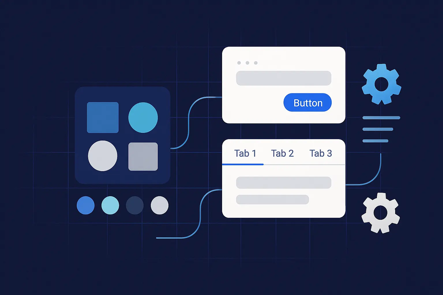
- Tokens turn brand decisions (colors, type, spacing) into reusable variables that work across tools and platforms.
- Components are production‑ready UI building blocks wired to those tokens—documented, tested, and versioned.
- Governance is how changes happen: proposals, reviews, merges, releases, and deprecations.
If you set up these three pieces well, you’ll create a system that’s easy to adopt, safe to change, and measurable over time.
Why design systems matter
A good system is a force multiplier. It pushes consistency, speeds up delivery, and reduces decision fatigue. It also raises the floor on accessibility and performance because best practices live in the building blocks—not in a scattered set of one‑off files.
The building blocks
Design tokens
What they are: Named values that represent design decisions—things like color, typography, spacing, radii, elevation, motion, and breakpoints. Tokens are technology‑agnostic: the same source can output Figma variables, CSS custom properties, Android XML, iOS Swift, or JSON for a design API.
Levels to use:
- Base tokens (raw values):
color-blue-500: #2563eb,space-4: 0.5rem. - Semantic tokens (meaningful aliases):
text-primary: {color-blue-700},surface-elevated: {shadow-md}. - Component tokens (scoped):
button.primary.bg,tag.radius.
Naming: Keep it human and scalable. Use purpose first, then scale or state. Example: text-muted, border-strong, space-6, duration-200.
Example (JSON source)
{
	"color": {
		"blue": { "500": "#2563eb", "700": "#1d4ed8" },
		"gray": { "900": "#0f172a" }
	},
	"text": {
		"primary": { "$value": "{color.blue.700}" },
		"inverse": { "$value": "#ffffff" }
	},
	"radius": { "sm": "4px", "lg": "12px" },
	"space": { "4": "0.5rem", "6": "0.75rem" }
}
Example (CSS output)
:root {
	--color-blue-500: #2563eb;
	--color-blue-700: #1d4ed8;
	--text-primary: var(--color-blue-700);
	--radius-sm: 4px;
	--space-6: 0.75rem;
}
Do’s for tokens
- Use a limited scale for color, space, and type. Don’t add a new size for every component.
- Map tokens to real use (semantic names) so themes and brand refreshes are painless.
- Keep the token source in version control; generate platform outputs in CI.
Components
What they are: Reusable UI pieces (Button, Input, Modal, Tabs) with clear anatomy, states, and slots.
What “done” looks like
- Token‑wired styles (no hard‑coded hex values).
- Variants and states documented (size, emphasis, disabled, loading, error).
- Accessibility baked in (focus order, ARIA roles, contrast, motion preferences).
- Copy‑pastable code for the target stack, with tests and usage examples.
- Change log entries and migration notes when APIs change.
Component anatomy (example: Button)
- Parts: container, label, optional leading/trailing icon.
- Tokens:
button.radius,button.padding.x,button.primary.bg,button.primary.text,focus.ring. - States: default, hover, active, focus, disabled, loading.
Documentation essentials
- When to use / when not to use.
- Props and variants table.
- Behavior rules (keyboard, truncation, wrapping).
- Accessibility callouts and examples.
How tokens and components connect
Tokens are the API for visual decisions. Components consume them so you can theme, localize, or refresh branding without rewriting CSS. A Button shouldn’t know a hex code; it should know it uses text-primary on surface-action with focus-ring at 2px.
Governance: how changes happen (without chaos)
Healthy systems treat UI as a product with owners, backlog, and releases.
Roles
- Maintainers: own quality, review proposals, ship releases.
- Contributors: file issues, propose changes, submit PRs.
- Consumers: use components in products, report gaps and bugs.
Operating model
- Propose: Open an RFC with problem, use cases, alternatives, and acceptance criteria.
- Review: Design + engineering review for accessibility, performance, and API stability. Decide within a set SLA (e.g., 5 business days).
- Build: Pair design and code. Add tests (unit, visual regression, accessibility checks) and docs.
- Release: Use SemVer. Breaking changes require migration notes and deprecation periods.
- Adopt: Announce changes in a central channel. Track adoption and support migrations.
Automation you want early
- Linting for tokens and component API changes.
- Visual regression tests on PRs.
- Contrast checks and keyboard traps in CI.
- Changelog and docs generation from commit messages.
Decision hygiene
- Keep a decision log (link from each RFC).
- One owner per artifact (token set, component, documentation page).
- Time‑box debates; ship small, reversible changes when possible.
Metrics that keep you honest
- Coverage: % of UI using system components.
- Adoption: active consumers, packages installed, version skew.
- Quality: accessibility issues per release, defect rate, P95 render time.
- Flow: cycle time from proposal → release, PR review time.
A 30‑day starter plan
Week 1 — Inventory and intent
- Audit 3–5 high‑traffic screens. List duplicate patterns and one‑off styles.
- Choose a token toolchain and agree on naming.
- Pick two starter components (e.g., Button, Input) with clear ROI.
Week 2 — Tokens in code
- Create base and semantic tokens; generate platform outputs.
- Wire tokens into Button and Input; remove hard‑coded styles.
Week 3 — Docs and tests
- Stand up a docs site (even a README is fine to start).
- Add usage examples, props tables, and accessibility notes.
- Add visual regression and contrast tests to PRs.
Week 4 — Governance and release
- Write the RFC template, contribution guide, and decision log format.
- Cut v0.1.0 with changelog and migration notes.
- Announce the pilot; invite one product team to adopt and give feedback.
Ship‑ready checklist
- Tokens are versioned, generated in CI, and used in components (no hex codes in source).
- Components document anatomy, states, accessibility, and usage.
- SemVer, changelog, and migration notes exist for each release.
- Visual and accessibility tests run on every PR.
- Decision log and RFCs link to released changes.
- Metrics dashboard shows coverage, adoption, quality, and flow.
FAQ
Do we need tokens if we only ship web? Yes. Tokens give you naming, theming, and governance even if you stick to CSS. If you go multi‑platform later, you’re ready.
We already have a Figma library—is that a design system? It’s a good start. A full system adds code, tests, docs, and change management so design intent and production are always in sync.
How do we handle themes (light/dark/brand)? Use semantic tokens as the switch. Each theme maps the same names to different values; components don’t change.
Want help standing up your first release? get design consultation.